TrainAsONE
ROLE: Service Designer (+ UX/UI)
PROJECT: Improve new-user app onboarding and retention rates
Research: Lean canvas - Competitor reviews - Affinity mapping - Empathy mapping - Personas - Task analysis - Experience mapping/ user journey
Design: User flows - Sketching - Figma - Sketch - Photoshop - InDesign - InVision
STAGE 1: UNCOVERING THE PROBLEM
THE BRIEF
TrainAsONE are an award winning AI running coach who provides personal coaching adapted to user’s specific health and personal fitness goals by connecting with a user’s wearable device/ phone to translate their data. This then optimises their activity by suggesting workouts that change in real time to accommodate their specific physical condition, as well as the weather and terrain.
TrainAsONE were connecting well with experienced runners, but wanted to tap into the growing beginner market. This project involved Discovery and Alpha phases.
Metric targets: improve onboarding and retention rates of people looking to train for their first charity run.
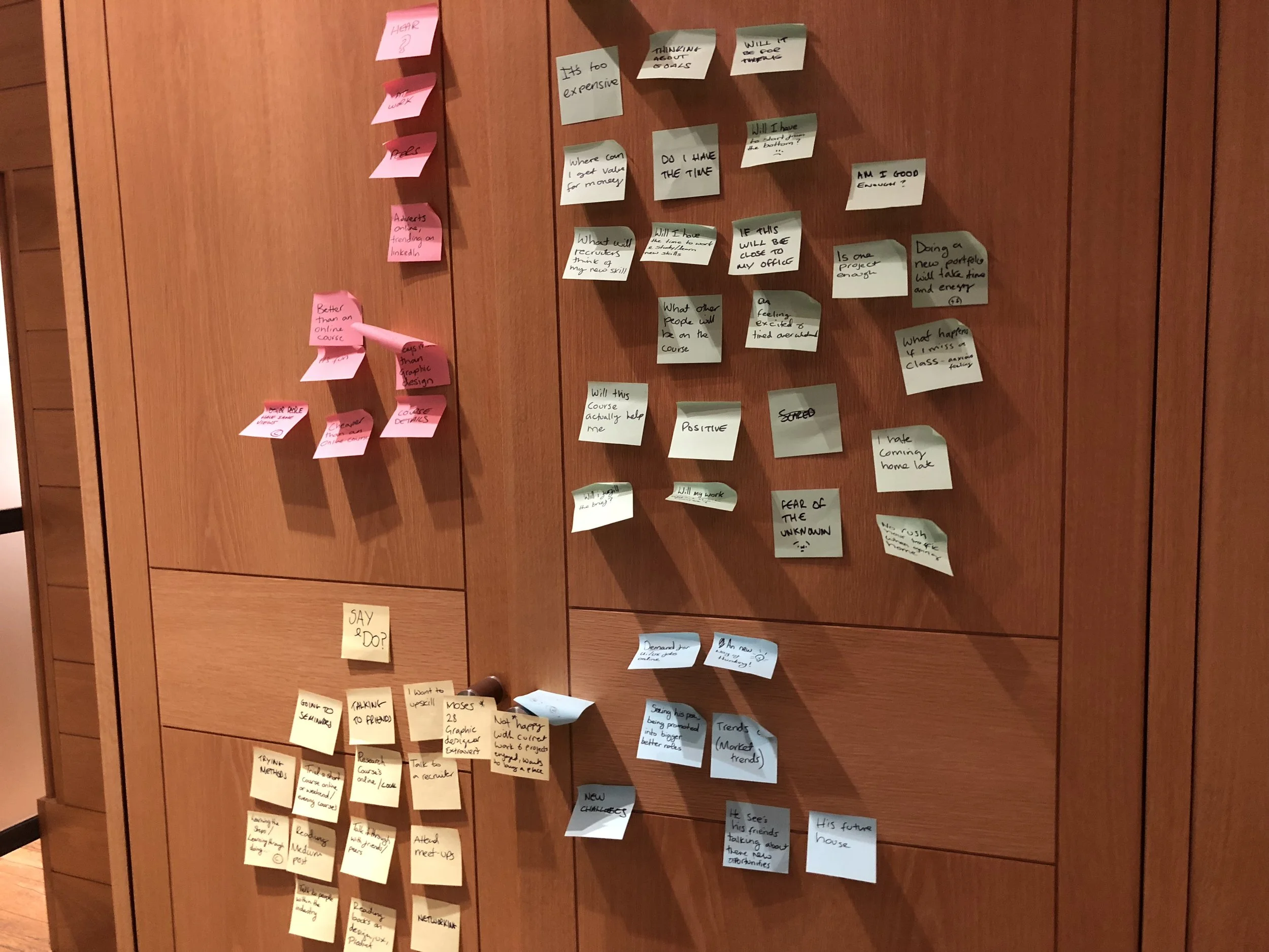
RESEARCHING THE BARRIERS
I started by researching the user journey of first-time charity runners. I conducted quantitative research using the online tool TGI and qualitative research, conducting 14 in-depth interviews with people who have/ will run their first charity run in 2018/19.
Organising the results revealed a number of common goals, fears first-time runners have, and the opportunity TrainAsONE have to help the audience. I used this to create the persona below.

Claire: my first-time charity runner persona
EXPERIENCE MAPPING
On average, people sign-up for a charity run 4 months before the run itself. Within these four months, there’s a huge range of emotions; from pitiless despair to first-pumping jubilation. As my brief was to look at both onboarding AND retention, I mapped out this journey, based on my Persona of Claire, to understand fully where TrainAsONE could play throughout the full journey.

Empathy mapping helped plot the range of emotions felt over the 4 month period
Claire’s Experience Map of her first charity run revealed three key moments to focus on (below)
The experience map uncovered three problem statements facing Claire:
Onboarding
When I’m signing-up, I want to find a plan that can work specifically for my goals and prevent me from injury
Retention short-term
When I join, I want to easily be able to understand what my next run is, so I can put all my effort into the run itself, not figuring out the plan
Retention long-term
When I’m training I want to be able to see my end goal, so I can be reminded of what I’m trying to achieve
STAGE 2: REVIEWING THE CURRENT PRODUCT
With three clear, insight-driven problem statements, I researched to what extent TrainAsONE were meeting these problem statements, and what could be done to improve on it. I tested the current site with my 14 first-time runners, looking specifically as how TrainAsONE was answering the three problem statements.

Homepage
Onboarding: Reviewing the Homepage The core issue with the Homepage was that it didn’t explain why people should join TrainAsONE over other plans; its core features weren’t explained in compelling ways and overall first-time runners didn’t think it was for them.

Dashboard
Retention short-term: The first page new users were greeted with, once signed-up, was the above Dashboard. The overall feeling from the Dashboard was that it was overwhelming and unengaging, with almost all users saying that even if they did sign-up, they would not know how to do their first run, nor would they be bothered to figure it out. Research revealed that making the Next Run section as simple and accessible to follow as possible was essential, otherwise people would simply move to a different plan or stop using a training plan altogether.

Goals and Races
Retention long-term: research showed that the most exciting time during the user journey was completing the race itself and receiving donation money. But, whilst the current site did have a Goals section, which could be used to motivate users to complete their net race, the page itself was hidden and unmotivating.
CONCLUSIONS
Overall it was clear that there was an opportunity for TrainAsONE to better meet the needs of the three problem statements researched. From reviewing the current product I added actions to how I would approach each problem statement within my solution (below).
Onboarding
When I’m signing-up, I want to find a plan that can work specifically for my goals and prevent me from injury
Action
Clearly list the rational and emotional benefits of TrainAsONE
Retention short-term
When I join, I want to easily be able to understand what my next run is, so I can put all my effort into the run itself, not figuring out the plan
Action
Make the ‘Next Run’ section as simple to understand as possible
Retention long-term
When I’m training I want to be able to see my end goal, to remind me of what I’m trying to achieve
Action
Visually represent Claire’s goal in a more prominent and engaging way
STAGE 3: BUILDING A SOLUTION
With 64% of current users accessing the site through mobile, I designed mobile-first, whilst still taking into account Desktop and Tablet designs.
Homepage
I prioritised adding a bold heading to draw in the user, quickly supported with clear benefits that set TrainAsONE apart from other training plans. The other sections (price, partners, reviews) were tightened up visually, so the key information could be understood with ease.
Articles
Research showed that the Articles section, which included interesting case-studies, motivated people to sign-up. I re-designed this section to allow clearer navigation between topics and work well across mobile and desktop.
Dashboard
Below the ‘Next Run’ I added space for the Goal to be visualised, both as a countdown until the race day and a tracker showing how much money had been raised so far. Experience Map research showed these to be the biggest motivators in completing the race.

Homepage Articles Dashboard
RESEARCHING THE MOCKUPS
Having mocked-up my designs on Figma and InVision, I researched each with both my 14 first-time runners and further potential users, testing the flow, language and layout of each. Common findings were that my language needed to be more precise. Visually, I needed to centre my titles and make them bolder, whilst also giving them more space around them.
For the Dashboard, users found the Goal section very motivational and most asked for it to go at the top. Refining my design, I decided to create a mini-Goal section at the very top of the Dashboard, with a more detailed one below the Next Training Run. This would mean that once someone logged in, they could instantly be reminded of their Goal, whilst also easily seeing what their next training run was.
Undertaking this research was essential in defining my final solution.
High Fidelity
Homepage: Beyond displaying the information in a clearer and more compelling way, I moved the visual identity on; the gradient is more own-able and engaging within the fitness space.
Articles: The Articles section continues with the new colour palette, whilst introducing a more consistent photographic style; monochrome and subdued to allow focus to remain on the Article title and its category. Simpler navigation was a core focus of this section, as research revealed that different new users were motivated to join by different posts.
Linking to JustGiving Page: When signing up for TrainAsONE there’s an option to input the race you’re training for. During this stage I added in the opportunity to link the users’ Just Giving account, so they can see how much they’ve raised on their Dashboard.
Linking to JustGiving Page closer to race date: Research showed that many users sign-up for Just Giving, to raise money for their charity race, after they start training. So, if people don’t link their account whilst signing-up for TrainAsONE they would be prompted to link it at a later date, closer to their final Race day.


